Keep Calm; Bank On
Keep those words in mind as you log into a new, updated INB website in the coming days. Things will look different, but there’s no reason for alarm. In this case, “different” is better. The planned launch date is Jan. 13.
When you log in, you’ll probably notice right away that our home page screen isn’t cluttered with as much information as our current site. Instead, you’ll scroll to get additional content. This is because, as the website pros advocate, “People are used to scrolling.” In other words, our social media consumption has taught us to simply scroll until we see what we want to see. Which is a good segue to the top features of our new website.
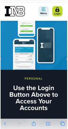
Better On Mobile Because Designed for Mobile
The primary reason for updating the site is to allow us to continue to provide you with the best banking experience possible. With averaging close to 50,000 users a month, we know how critical our website is. We also know that over 40 percent of all 2020 visitors used our website from a phone or tablet. With numbers like that, we knew it was important to redesign our site to allow the best mobile experience. Our current site adapts itself to mobile, but it wasn’t initially developed for small-screen use.
Along with making the website more responsive on different platforms, the update is also allowing us to make some other significant improvements:
Easy Access to Accounts
While our account login is obvious on our current site, there’s no missing it on our new website. The big, green login button at the top right of the screen takes a simple click to see all the INB account options. Personal, digital banking is at the top of the list, with business banking, and trust, credit card and wealth access right below.
Keyword Taxonomy Search
You’re probably familiar with keyword taxonomy thanks to Google searches.
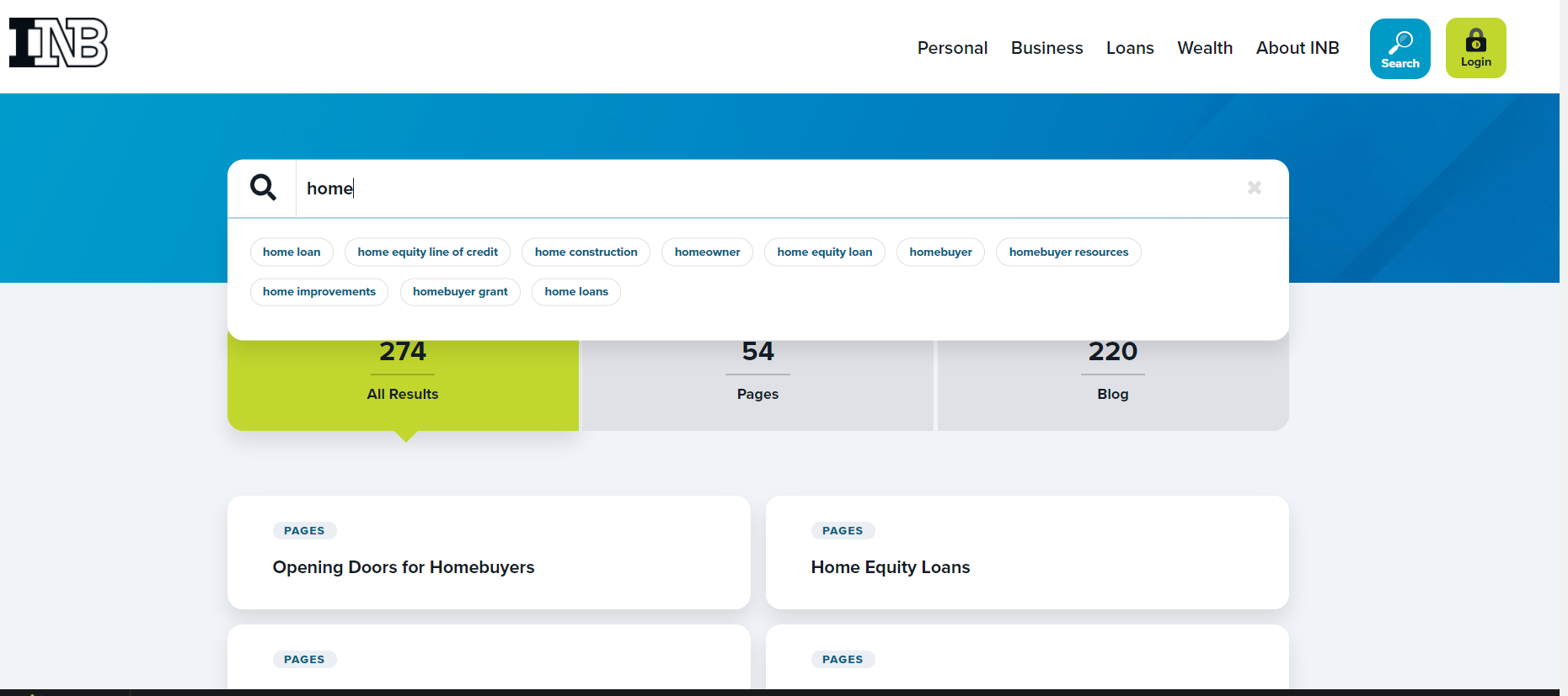
With the implementation of keyword taxonomy on our site, searching for something just got easier. For example, you type in “home,” and you’ll get suggestions as to what you’re looking for. Home loan calculator? Home loan pre-qualification? Home loan? And if we identify something by one name -- Agriculture Loans, for example -- but you use the term “Farm Loans,” we’ve tagged pages about ag loans to be found when searching on “farm.”
More Readable by People with Disabilities
Our current website contains a lot of white type on a dark background. Add to that, the navigation lettering is very small. We also confuse audio screen readers by putting words into photos; screen readers read the NAME we give a photo, not the words on the photo.
So while our design techniques may look nice, they are a hindrance to people who don’t see well. Our design changes assure readability by both people with limited eyesight and screen readers.
Improved ATM and Branch Locator
When we joined the MoneyPass network, we added thousands of ATMs for you to use for free. Now you can bring in MoneyPass data on our site by clicking the “MoneyPass ATM” tab at the top of our “Locator” page. If you scroll past the map, you can add a specific geographic area to narrow down your results. This will be especially helpful when traveling.
Customized Content to Your Interests
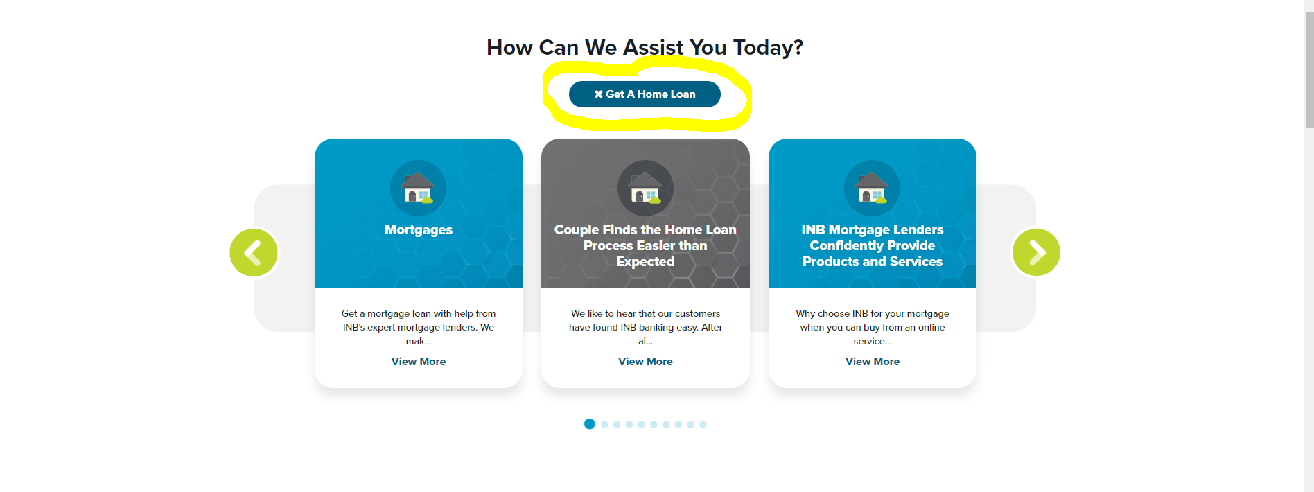
One of the most significant changes to our home page will be the custom content area. If you come to the site and show interest in a home loan by clicking on a blog post about loan prequalification, for example, you will see home loan content in your custom feed the next time you visit our site. You’ll continue to get content on that topic until you “x” out. When you do, the content will revert to a general feed until you choose to visit another article in this section of the website.
We hope the update makes your banking experience easier than ever.
The work on our site was completed by LRS. Here, they share their insights on developing the updated INB site.